COVID-19 dashboard using WHO Situation Report data
My COVID-19 dashboard is interactive and flexibleNow that I successfully gathered all the case details from the Situation Reports, I can visualize the data in the COVID-19 Pandemic Dashboard


Here is a direct link to the COVID-19 Pandemic Dashboard.
DigitalStaff is not in any way affiliated with, sponsored by, or endorsed by the WHO.
Everyone on the planet is affected in some way by the COVID-19 pandemic. People want to know how the virus is spreading, how many people are affected, and when will this whole thing blow over.
The question of when the pandemic will be over is of utmost importance to everyone across the world. But there are some people that are more affected by COVID-19 than others, like my almost 91 year old grandfather.

My grandfather and I enjoying the sun in Dublin
My grandfather is in a long-term care home in Ireland and someone at the home has a suspected case of COVID-19.
I am worried for the health of my grandfather. He’s my only remaining grandparent and I love him dearly. But what can I do to help him out? I can’t fly over to help him in Ireland. There really isn’t much I can do but wait and see.
So in order to feel like I’m doing something to help, I am constantly checking in on the virus and how it may affect my grandfather and my other loved ones. I decided to go ahead and build my own custom COVID-19 dashboard using data pulled from the World Health Organization’s official Situation Reports to allow me to more easily keep track of the situation.
Existing dashboards are static and not very interactive
It seems that almost everyone has seen the Johns Hopkins University (JHU) COVID-19 map [1] or the Worldometers’ COVID-19 case information page. [2] Even the WHO itself has a couple of live dashboards. [3] [4]

COVID-19 Map - Johns Hopkins University - CSSE
What I noticed about these resources is that they are very static. There isn’t much you can do with the data. You can’t easily compare countries, or look at specific time periods, or sort the data that you get to look at. The dashboards are all very ‘one size fits all’ solutions.
Other dashboards use many sources of data and their totals may be exaggerated
JHU is doing a phenomenal job of compiling cases from all over the world and from a large number of sources. [5] However JHU is not extremely transparent and they do not actually reference where each of the case counts come from.
Worldometers on the other hand seems to be very transparent about the sources they use for their case counts, but is every source they use 100% reputable? And are Worldometers spending a lot of time reviewing each case and comparing it against the thousands or tens of thousands of new daily cases to ensure that they are not double counting? They don’t mention anything about exactly how they calculate their cumulative totals.
You can trust the WHO’s numbers
The Situation Reports [6] are released daily by the World Health Organization (WHO) and contain only confirmed cases of COVID-19. The WHO gathers these case counts through official Government channels with its 194 member states. The total case count may lag behind other sources, but you can be sure that the WHO’s conservative data is fully vetted and reliable.
As of April 4th at 12:59am, here are the cumulative case counts on the COVID-19 pandemic:
- 1,099,711 cases reported by Worldometers
- 1,099,389 cases reported by Johns Hopkins University
- 972,303 cases reported by the WHO in Situation Report #74
The WHO had a budget of $4.42 billion USD in 2018-2019. [7] The WHO have the resources to ensure the quality of the data and that the cases are accurately recorded, not double counted, of truly lab confirmed COVID-19 cases. No offense JHU and Worldometers, I still think you have the some of the coolest COVID-19 dashboards around.
A disclaimer about my dashboard’s numbers
Please note that the numbers that are displayed in the dashboard I created may be slightly different from the totals in the WHO Situation Reports. This is due to the way that we calculate our totals, which we do by adding up all of the “new daily cases” for that Situation Report.
The WHO themselves say on many of their Situation Reports that “due to differences in reporting methods, retrospective data consolidation, and reporting delays, the number of new cases may not always reflect the exact difference between yesterday’s and today’s totals.” So you can see why the numbers reported in my dashboard may be slightly different.
As of April 4th, the numbers on my dashboard for cumulative case counts are within 0.1% of the official Situation Report values. Pretty close, I would say. If there is sufficient interest I could improve the accuracy of the automation to 100%. Just let me know.
If you want to know the most official, most accurate, and most trustworthy case numbers, please refer to the Situation Reports themselves.

One of the tables from WHO Situation Report #73
Unfortunately the numbers in the Situation Reports are not very accessible
The Situation Reports are PDFs that have tables embedded within the file. The thing about PDFs is that you can’t just copy and paste it into Excel and have your numbers nicely formatted. So you need to put in some work to gather usable data from these documents.
Perhaps this is why Johns Hopkins University COVID-19 dataset [8] doesn’t contain the most up to date Situation Report information because it can be a tedious and slow process to extract these numbers and format them perfectly. JHU’s Situation Report data is 9 days old
Gathering data from the Situation Reports with RPA
To gather the data from these Situation Reports, I put my programming skills to the test and I created an automation using the UiPath Robotic Process Automation (RPA) platform. [9]
This automation uses the computer just like a person, and it does the following:
- Reads the Situation Report PDF
- Extracts the case numbers from the tables
- Tidies and formats the data for use in the dashboard
- Automatically updates the dashboard’s database
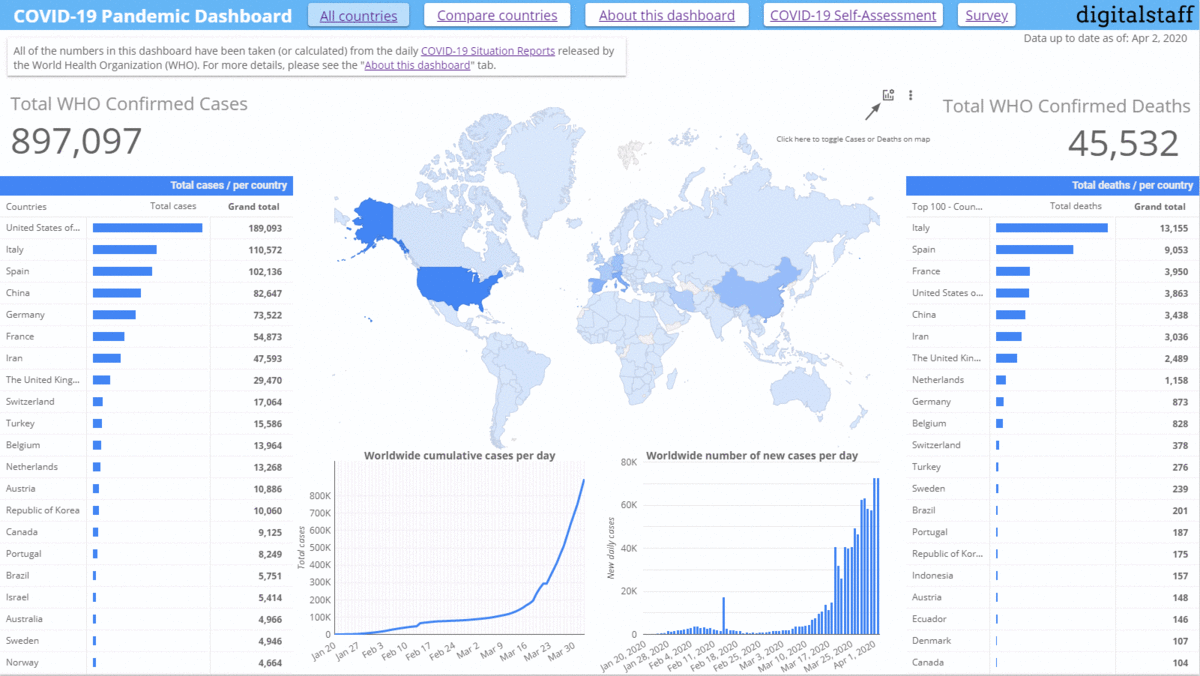
My COVID-19 dashboard is interactive and flexible
Now that I successfully gathered all the case details from the Situation Reports, I can visualize the data in the COVID-19 Pandemic Dashboard [10]. You can do some pretty nifty things with the numbers in Data Studio. For example, you can select which countries to show on the graph and visually see how their cumulative case count is growing linearly and logarithmically.
You can also select the time period of the data, so if you wanted to zoom in on a certain couple of days or weeks, you could do that.
Of course, there are the static graphs that show the cases, deaths, and other details.
Attempting to answer the question: “when will this be over?”
At the moment, the dashboard I created simply conveys the facts shared by the WHO. However, I am currently researching methods of modeling the curve [11] [12] and then predicting where we will be in the future. I hope that soon I will have updated the dashboard to include predictions and other estimations, including the number of “real number of cases”.
So please, take a look at the dashboard I put together and use it to better understand this strange time period that we are living in! If you have any suggestions, improvements, or feedback to share with me, please reach out to me directly, or submit it via the survey in the dashboard.
I hope that you, your loved ones, my grandfather, and everyone else on this planet manages to pull through this ordeal.
Stay well,
Oscar
Sources
[1] JHU - CSSE, “COVID-19 Map,” Johns Hopkins Coronavirus Resource Center, accessed April 2, 2020, https://coronavirus.jhu.edu/map.html.
[2] Worldometers, “Coronavirus Update (Live): 1,054,434 Cases and 55,720 Deaths from COVID-19 Virus Outbreak - Worldometer,” accessed April 2, 2020, https://www.worldometers.info/coronavirus/.
[3] WHO, “Coronavirus Disease (COVID-19) Situation Dashboard,” accessed April 2, 2020, https://experience.arcgis.com/experience/685d0ace521648f8a5beeeee1b9125cd.
[4] WHO, “WHO Health Emergency Dashboard,” accessed April 2, 2020, https://extranet.who.int/publicemergency.
[5] JHU - CSSE, “COVID-19 Dataset GitHub,” GitHub, accessed April 2, 2020, https://github.com/CSSEGISandData/COVID-19.
[6] WHO, “Coronavirus Disease (COVID-2019) Situation Reports,” accessed April 2, 2020, https://www.who.int/emergencies/diseases/novel-coronavirus-2019/situation-reports.
[7] WHO, “Programme Budget 2018-2019,” accessed April 2, 2020, https://www.who.int/about/finances-accountability/budget/PB2018-2019_en_web.pdf.
[8] JHU - CSSE, “JHU Situation Report Data,” accessed April 2, 2020, https://github.com/CSSEGISandData/COVID-19/tree/master/who_covid_19_situation_reports.
[9] UiPath, “Robotic Process Automation | UiPath,” accessed April 2, 2020, https://www.uipath.com.
[10] DigitalStaff, “COVID-19 Pandemic Dashboard [V2],” Google Data Studio, accessed April 2, 2020, http://datastudio.google.com/reporting/1NWawcc9m742EPMY0meZxerEN8S-NjGnf/page/ROQKB.
[11] Tomas Pueyo, “Coronavirus: Why You Must Act Now,” Medium, April 2, 2020, https://medium.com/@tomaspueyo/coronavirus-act-today-or-people-will-die-f4d3d9cd99ca.
[12] Tomas Pueyo, “Coronavirus - When Should You Close Your Office?,” Google Docs, accessed April 2, 2020, https://docs.google.com/spreadsheets/d/17YyCmjb2Z2QwMiRRwAb7W0vQoEAiL9Co0ARsl03dSlw.